Understanding the Power of Color
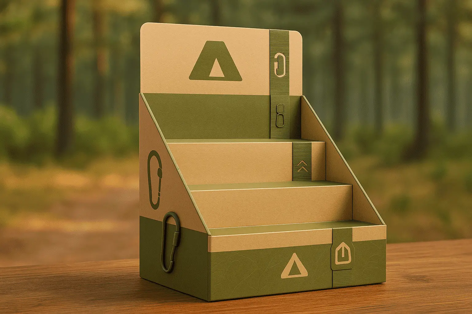
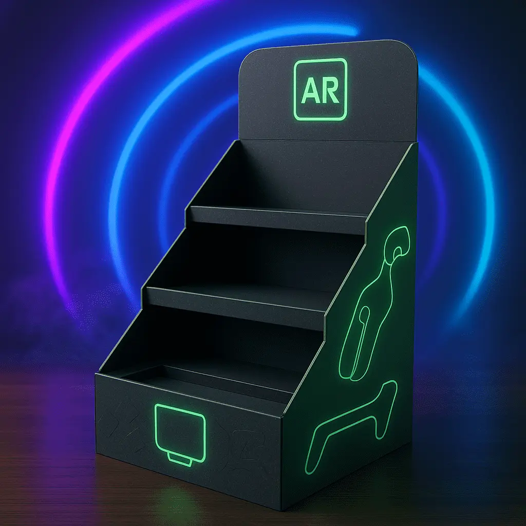
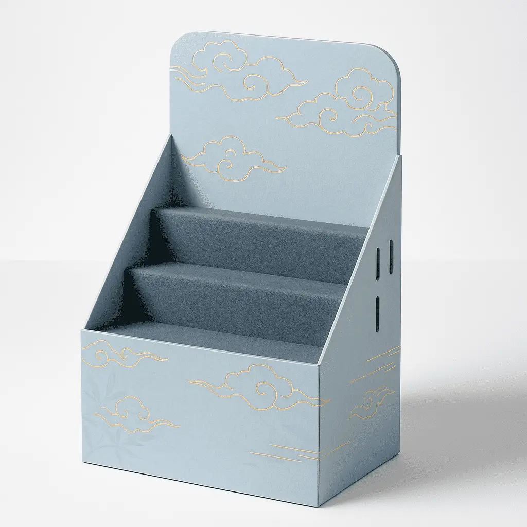
Color plays a pivotal role in shaping consumer perceptions and emotions. When designing color mailer boxes, it's essential to grasp the psychological impact of different hues and how they can influence your target audience. For instance, blue often conveys trust and reliability, while green may evoke feelings of nature and sustainability. By aligning your color choices with your brand values and the emotions you want to elicit, you can create a more powerful and cohesive brand experience.
Selecting a Cohesive Color Palette
Developing a harmonious color palette is crucial for maintaining brand consistency across your packaging materials. When choosing colors for your color mailer boxes, consider your existing brand colors and how they can be integrated or complemented. A well-crafted color scheme can help your packages stand out while reinforcing your brand identity. Experiment with different color combinations, such as monochromatic, analogous, or complementary schemes, to find the perfect balance for your brand.
Utilizing Color Contrast for Visual Impact
Effective use of color contrast can significantly enhance the visual appeal of your mailer boxes. By juxtaposing light and dark colors or complementary hues, you can create eye-catching designs that grab attention and improve readability. Consider using contrasting colors for your logo, text, and background elements to ensure that important information stands out and is easily discernible. This technique not only improves the aesthetic appeal of your packaging but also enhances its functionality.
Incorporating Brand Elements for Consistent Messaging
Integrating Your Logo and Brand Identity
Your logo is the cornerstone of your brand identity, and it should feature prominently on your color mailer boxes. Consider creative ways to incorporate your logo into the overall design, such as using it as a repeating pattern or integrating it into a larger graphic element. Ensure that your logo is placed in a visible location and sized appropriately to maintain its impact and legibility. Consistency in logo placement across different packaging sizes and styles will help reinforce brand recognition.
Crafting Compelling Brand Messaging
Your color mailer boxes provide an excellent opportunity to communicate your brand's story and values. Develop concise and impactful messaging that resonates with your target audience and aligns with your overall marketing strategy. Consider incorporating your brand tagline, mission statement, or key selling points into the design. Use typography that complements your brand aesthetic and ensures readability. Remember that less is often more when it comes to packaging copy, so focus on delivering your message clearly and succinctly.
Leveraging Unique Brand Patterns and Textures
To further enhance brand consistency and create a distinctive look, consider incorporating unique patterns or textures into your color mailer box design. These elements can be inspired by your product, industry, or brand personality. Custom patterns can be used as background elements or as accents to add visual interest and depth to your packaging. Additionally, exploring different printing techniques, such as embossing or spot UV, can add tactile elements that make your mailer boxes more memorable and engaging.
Optimizing Design for Maximum Impact and Functionality
Balancing Aesthetics and Practicality
While creating visually appealing color mailer boxes is important, it's equally crucial to ensure that the design doesn't compromise functionality. Consider factors such as ease of assembly, durability during shipping, and protection of the contents when making design decisions. Strive for a balance between eye-catching aesthetics and practical considerations to create packaging that not only looks great but also performs its primary function effectively.
Embracing Minimalism and White Space
In the world of packaging design, sometimes less is more. Embracing minimalism and strategic use of white space can create a sophisticated and modern look for your color mailer boxes. This approach can help highlight key brand elements and prevent the design from appearing cluttered or overwhelming. Carefully consider which elements are essential to include and how they can be arranged to create a clean, impactful design that aligns with your brand identity.
Incorporating Interactive and Surprise Elements
To create a truly memorable unboxing experience, consider incorporating interactive or surprise elements into your color mailer box design. This could include hidden messages revealed when the box is opened, perforated sections that transform the packaging into a useful item, or QR codes that link to exclusive content. These innovative features not only enhance the customer experience but also encourage social sharing and word-of-mouth marketing, further extending the reach of your brand.
Conclusion
Mastering the art of color mailer box design for brand consistency requires a thoughtful approach that balances aesthetics, functionality, and brand identity. By leveraging color psychology, integrating key brand elements, and optimizing design for maximum impact, you can create packaging that not only protects your products but also serves as a powerful marketing tool. Remember that consistency across all touchpoints is key to building a strong brand identity, and your color mailer boxes play a crucial role in this effort. With careful planning and creative execution, your packaging can become a memorable extension of your brand that delights customers and drives loyalty.
Contact Us
Ready to elevate your brand with custom color mailer boxes that make a lasting impression? Our team of packaging experts at Guangzhou Huadu Fetching Color Printing and Packaging Co., Ltd. is here to help bring your vision to life. From concept to creation, we'll work closely with you to design and produce color mailer boxes that perfectly align with your brand and captivate your audience. Contact us today at support@fetchingprinting.com to start your journey towards packaging excellence!