Understanding the Impact of Color in Packaging Design
The Psychology of Color in Marketing
Color psychology plays a pivotal role in marketing and brand perception. Different hues can evoke specific emotions and associations, influencing how consumers perceive your product. For instance, blue often conveys trust and reliability, while green is associated with nature and eco-friendliness. Red can signify excitement or urgency, and yellow typically represents optimism and cheerfulness. Understanding these psychological effects can help you choose a color scheme that aligns with your brand message and resonates with your target audience.
Color Trends in Packaging Industry
Staying abreast of color trends in the packaging industry can give your brand a contemporary edge. While classic colors like white, black, and kraft remain popular for their versatility, bold and vibrant hues are gaining traction. Pantone's Color of the Year often influences packaging trends, so it's worth considering these annual selections. However, it's essential to balance trendiness with timelessness to ensure your packaging remains relevant beyond short-term fads.
Brand Color Consistency Across Packaging
Maintaining color consistency across all your packaging materials is crucial for brand recognition. Your color mailer box should complement your overall brand palette and other packaging elements. This consistency helps create a cohesive brand image and reinforces brand recall. Consider using color matching systems like Pantone to ensure accuracy across different printing processes and materials.
Factors to Consider When Selecting Your Color Mailer Box
Target Audience Preferences
Your target audience's preferences should heavily influence your color choice. Different demographics may respond differently to various colors. For example, younger audiences might be drawn to bright, bold colors, while a more mature audience might prefer sophisticated, muted tones. Conduct market research or surveys to gather insights into your audience's color preferences and incorporate these findings into your decision-making process.
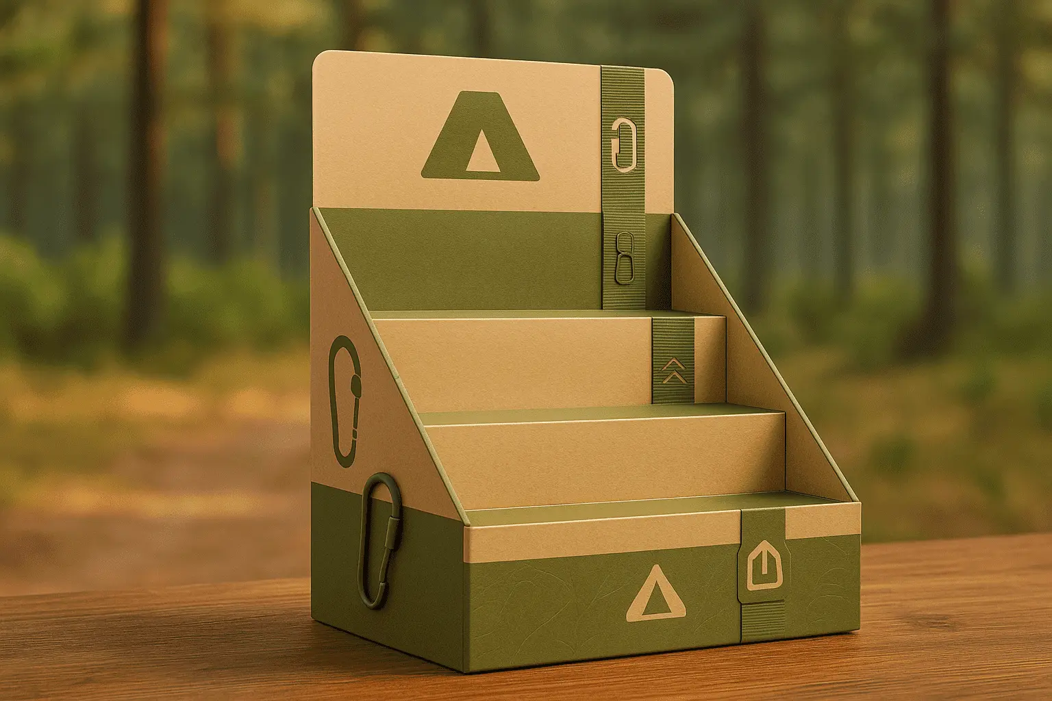
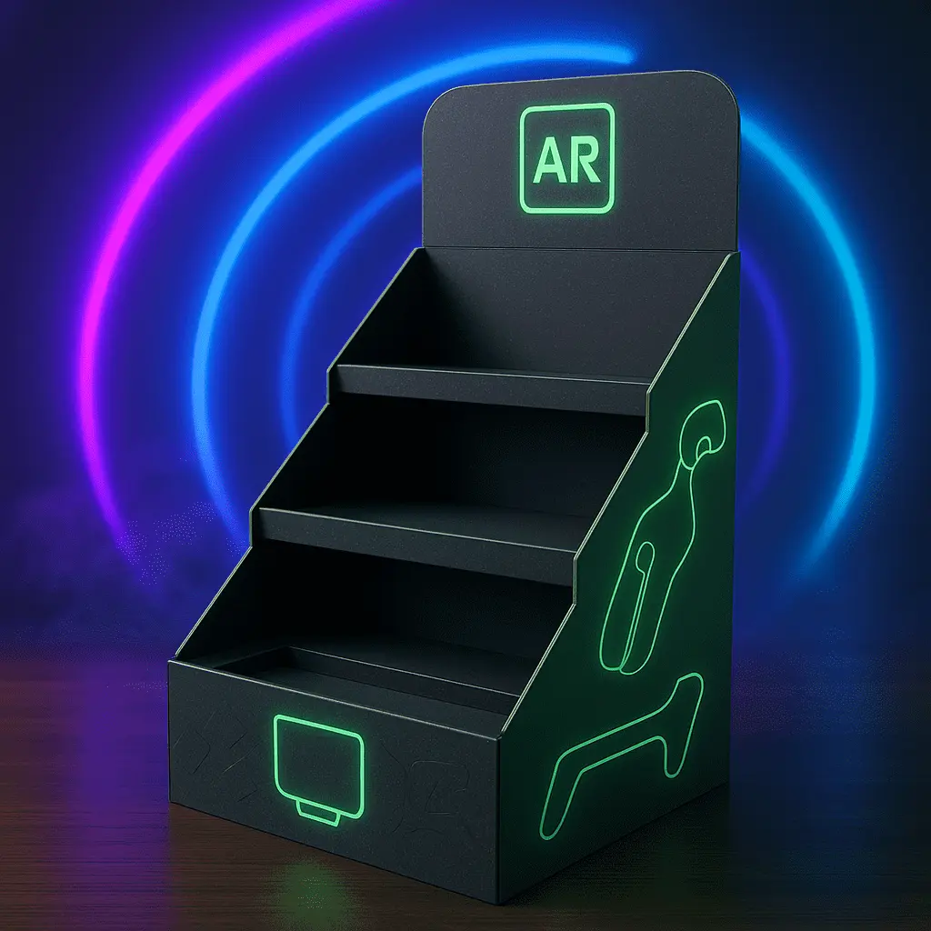
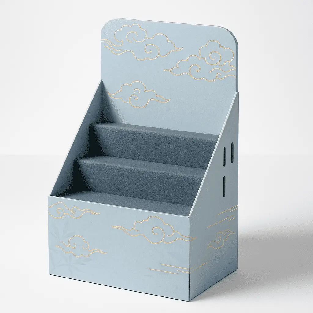
Product Nature and Industry
The nature of your product and industry norms should guide your color selection for the color mailer box. For instance, eco-friendly products often use green or earthy tones to reinforce their sustainability message. Luxury items might opt for metallic accents or deep, rich colors to convey premium quality. Consider how your color choice can complement and enhance your product's attributes and align with industry expectations.
Printing Techniques and Limitations
When selecting colors for your mailer box, it's important to consider the printing techniques available and their limitations. Some vibrant or metallic colors may require special printing processes, which could impact your budget. Additionally, certain materials may affect color reproduction. Consult with your packaging supplier to understand the range of colors achievable with different printing methods and materials, ensuring your chosen hues translate accurately from design to final product.
Innovative Color Strategies for Standout Packaging
Using Color Blocking and Gradients
Color blocking and gradients can create visually striking mailer boxes that capture attention. Color blocking involves using two or more distinct colors in clearly defined sections, creating a bold, modern look. This technique can be particularly effective for brands with multiple product lines, using different color combinations to distinguish between product categories. Gradients, on the other hand, offer a smooth transition between colors, adding depth and sophistication to your packaging design. These techniques can make your color mailer box stand out on shelves or in social media unboxing videos.
Incorporating Seasonal Color Schemes
Adapting your color mailer box to seasonal themes can create timely and engaging packaging experiences. Consider creating limited-edition color schemes that align with holidays, seasons, or special events. For example, you might use warm, autumnal colors for fall promotions or cool, refreshing hues for summer collections. This approach not only keeps your packaging fresh and exciting but also encourages repeat purchases as customers look forward to new, seasonally-inspired designs.
Leveraging Color for Product Protection
While aesthetics are important, don't overlook the functional aspects of color in packaging. Certain colors can serve protective purposes, such as reflecting heat or blocking light to preserve product integrity. For instance, amber or dark-colored mailer boxes can protect light-sensitive products from UV damage. Consider these functional benefits when selecting colors, especially if your products require specific storage conditions or have sensitivity to environmental factors.
Conclusion
Choosing the right color mailer box for your brand packaging is a multifaceted decision that requires careful consideration of various factors. By understanding color psychology, staying aware of industry trends, and aligning your choices with your brand identity and target audience, you can create packaging that not only protects your product but also serves as a powerful marketing tool. Remember to balance aesthetics with functionality, and don't be afraid to innovate with color techniques like blocking or gradients. Ultimately, the perfect color mailer box will enhance your brand recognition, engage your customers, and contribute to a memorable unboxing experience.
Contact Us
Ready to elevate your brand with custom color mailer boxes? Let our experienced team help you create packaging that stands out and resonates with your audience. Contact us today for a personalized consultation and bring your vision to life. Reach out to us at support@fetchingprinting.com to start your journey towards exceptional brand packaging.